January 2025 Update: We've updated the organization of the Reports tab, giving you access to advanced reports organized by their relevant subject.

ConnectSx utilizes the Google Looker tool for enhanced visual reporting and data exports, though things may look a bit different than they did before.
This article shows the different updated dashboards and explains how to access your data when pulling reports.
Previous Inventory Visualizations
Data Export Reports have been updated with Looker Functionality
Downloading your Data, Choosing your Filetype, and Selecting your Data Range
I'm not seeing all of my data/rows, how can I fix this?
Please note, the visualization data tables in the browser may have a row cap between 500-5,000 depending on the report. However, you may always access all of the results in the data selection by following these steps.
In between our major releases, we are hard at work finding new ways to make your ConnectSx experience valuable, and what better way than to continue to empower you to use your data. That’s why with the November 2023 release, we have a whole new reporting section to debut.
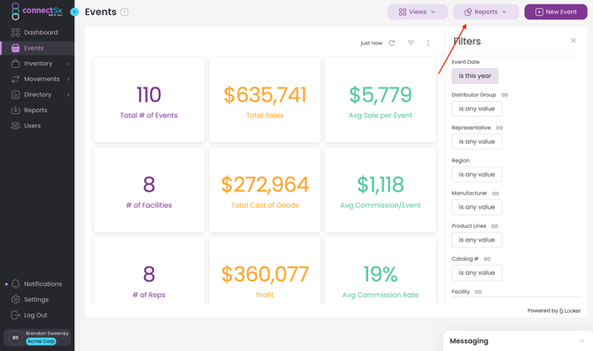
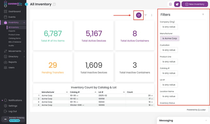
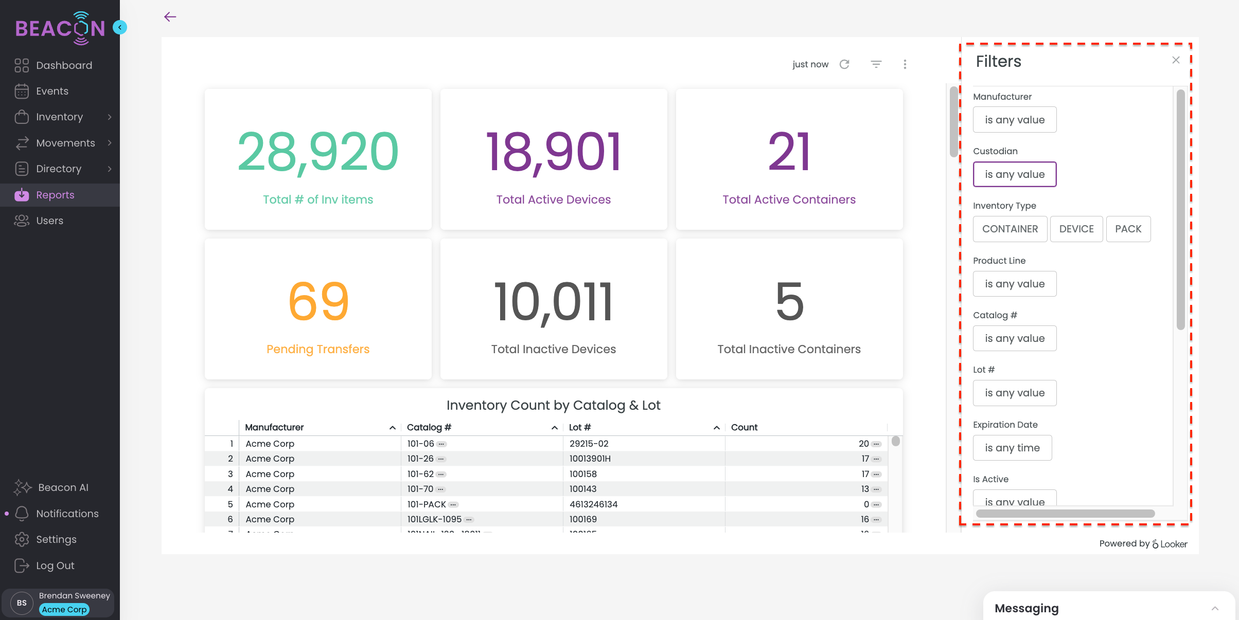
Now you’ll find your visualizations embedded (as noted above) on each screen relevant to that report data, in context to where and how you’ll need to find it. You’ll now see new high-quality dashboards of your sales and inventory data, powered by Google Looker. These reports automatically update once a day, early in the morning, so when you get in to the office you have a fresh dashboard reflecting all activity up through the previous day.
These visualization reports have a whole new look since they were originally debuted in February 2023, so make sure to check them out below!
Note: When using the Visualizations, filter selections must be made in the visualization window on the right side of the screen. Filters applied in the normal Events List or All Inventory screens will not carry over to the visualizations page.
Additionally, after selecting your filters you must refresh the report by clicking the Refresh Button at the top of the page (See below image).
Previous Inventory Visualization
-4.webp?width=670&height=374&name=image%20(7)-4.webp)
New Inventory Visualization
Utilize the filters along the right side of the screen to manipulate the data being displayed. Scroll down in the report page to see even more tables and data.
-4.webp?width=670&height=389&name=image%20(8)-4.webp)
BUT WAIT! Scroll down in the report to see even more!
-4.webp?width=670&height=389&name=image%20(9)-4.webp)
-May-31-2024-02-27-26-2777-PM.webp?width=670&height=389&name=image%20(10)-May-31-2024-02-27-26-2777-PM.webp)
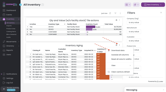
Click on the vertical ellipse icon in the upper right of the report to download your report.
Previous Sales Visualization
-4.webp?width=670&height=374&name=image%20(12)-4.webp)
New Sales Visualization
-May-31-2024-02-31-14-7309-PM.webp?width=670&height=389&name=image%20(13)-May-31-2024-02-31-14-7309-PM.webp)
-May-31-2024-02-31-29-9487-PM.webp?width=670&height=389&name=image%20(14)-May-31-2024-02-31-29-9487-PM.webp)
-4.webp?width=670&height=389&name=image%20(15)-4.webp)
-4.webp?width=670&height=389&name=image%20(16)-4.webp)
-3.webp?width=670&height=389&name=image%20(17)-3.webp)
-3.webp?width=670&height=389&name=image%20(18)-3.webp)
Data Export Reports have also been updated with the new Looker Functionality

To access, enter your filters as you would in the visualizations menus.
View your data right on the screen, then export your data whenever you’re ready.
Downloading your Data, Choosing your File type, and Setting your Data Range
The user interface is a little different than before, but you can download any of the data being displayed in the looker reports, you can even select different file types for your export!
-
Click on the “Kabob” menu (or the 3 vertical dots) in the upper right corner of the data table you want to export
-
Click “download all data”
-3.webp?width=670&height=401&name=image%20(21)-3.webp)
-
Next select your file type, you may select from:
-3.webp?width=670&height=401&name=image%20(22)-3.webp)
-
TXT
-
Excel Spreadsheet (Excel 2007 of later)
-
CSV
-
JSON
-
HTML
-
Markdown
-
PNG (Image of Visualization)
-
-
Next, click on “Advanced Data Options”
-
Make any changes you’d like, but we suggest changing the setting for “Number of rows” to “All Results”. This will ensure that if there is a visual limit on the table, say for 500 rows, the export will include all rows, even above the visual cap of the table.
-3.webp?width=670&height=400&name=image%20(23)-3.webp)
-
My report is not showing all of my results, how can I access more?
The new reports display boatloads of data right in the browser where you can review it, but there are limitations. Each table has a row cap between 500-5,000 rows due to the amount of data being displayed. However, you can always access the full data set by downloading the table and using the advanced download options:
-
Click Download on the table
-
Expand the Advanced Data Options
-3.webp?width=670&height=401&name=image%20(25)-3.webp)
-
Select the "All Results" option
-3.webp?width=670&height=401&name=image%20(26)-3.webp)
-
Click download.
Note: These reports need to be configured by the ConnectSx team. If you are a new customer or there is an issue with your reports generating, please submit a support ticket and we will get you up and running.